All posts tagged: colours

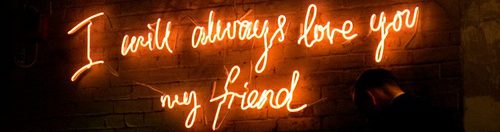
Courty – The Godfather of Neon

‘There’s red neon gas running through my veins.’ Much like the bold and commanding nature of neon art, Courty himself radiates a parallel presence that you simply couldn’t ignore if you tried. As an artist who has immersed himself into almost 3 decades of fine tuning his skill in the art of neon, Robert Court respectfully demands your attention through his use of light, colour and the written word. Robert Court began his career in 1987. His rich portfolio of work and achievements have illuminated a pathway towards being one of the most prominant neon artists of proud London origin. His bold work has featured in film and tv sets, theatre, books, and businesses, as well as prestigious galleries and events. Courty is signed by Wishbone Publishing (the wonderful team who also represent my work) this has awarded me the privilege of seeing Courty’s work emblazoning gallery walls in all their brilliant glory. His work is hand made with pure passion and enthusiasm, distincly obvious from the emanating love shown in his fantastic artist interview, …

‘Flutter’ Limited Edition Prints

A common question that I am asked is the distinction between ‘finishing or abandoning’ a painting (in terms of completing work) and which one applies to me?  There are two very different feelings when a painting is complete and is at most an unpredictable part of the process for me. Occasionally my idea is crystal clear enough to see when the finished version is in sight, or be unable to stop until I meet this mark in my mind. This is finishing the work that you set out with a cause, process and visual in mind. Abandoning the painting is a very different but equally as satisfying feeling, in when you reach a stage in the work where you feel it is right to stop. For whatever reason, it may be that the balance is right and anything more could be overworking it. Maybe you feel that what you are trying to put across has been successful and in going further could potentially spoil that. A number of reasons, even just that it ‘feels’ right to …

Very Short YouTube video – Oil Painting of starlings in flight

I am always looking at new ways to document the process of my work, I have done this in many ways already through creating time lapsed YouTube videos, to writing about it, to showing progress photos of close ups, sets ups and various stages of painting. One of the most asked questions about my YouTube videos was if I could use a higher quality devise to record from because the videos were not clear enough. For me, with painting it is all about the visual and if the smallest of brush strokes cannot be seen then there is no point, these are the marks that make up the painting as a whole. Ask and you shall receive! I am now working on getting to grips with better filming equipment to show more accurately what I am working on, and here is a very small taster of ‘Arcus Flight’ with a shot of John Frusciante. (Original painting sold, but soon available as a Limited Edition print) Make sure you subscribe to my channel here ready for more videos …

Second Collection of Original Oil Paintings with Wishbone Publishing / Katy Jade Dobson

I have been working recently on my second collection with Wishbone Publishing, a collection that I am incredibly   excited about. It has been a lot of fun to work on and showcases a lot of what I have learnt in the last few years as a professional artist. But above that I have injected mainly what I enjoy within this collection, the learning curve is palpable in the application and I love that it is raw and exposed in these original oil paintings. My work as always is selfishly about my process, my work thrives when my heart is fully engaged and I do not stop until the atmosphere is intimate and blatant. The success of my last collection was immensely unexpected and I am incredibly grateful to anyone who has supported my work over the last couple of years as I have found my feet. What I took from working solely on a full body of work is that your headspace during this period of creating can be temporary and down to circumstance. The …

Inspirations and Influences for Paintings – Working on my new collection.

I have been working on a new collection lately,  with an idea in mind that I wanted to be incredibly specific with… Without giving too much away,  I wanted to write about some of my influences in terms of colour and composition for my latest collection that I am currently working on with an insight into my favourite artists and images that have always inspired me. (Almost like a mood board of certain traits and aspects for this upcoming series of oil paintings.) Starting with colour and my favourite artist Odilon Redon – I learnt of Redon whilst working on a project at college where I imitated some of his works in oil pastels, his abstract tendencies and backgrounds specifically have been one of the most consistant inspirations for my work and hugely in mind when painting recently. I studied his cleverly positioned colour and admired how they looked so spontaneous. It wasn’t until learning this practice in oil paints and in my own style that I found that using a lot of colour all at once in …

View my first collection with Wishbone Publishing here!!!

The Spectrum Collection in full! My first collection with Wishbone Publishing is now available to view, with a handful of originals selling before the release and now the availability of a selection of limited editions. 10% of the sales from this collection will be donated to the Born Free charity, I am incredibly proud to have Born Free endorse this collection and to be included on the Certificates of Authenticity received on purchase. If you have enjoyed my previous work then hopefully the Spectrum Collection will appeal to you with a chromatic explosion of my favourite jewel toned colours to embellish a variety of wildlife species, all regal, proud and spectacular in their own rights. My collection is a celebration of the beauty and abundance in nature and a practice of my painting style that is both intricate and loose, serene and chaotic. Also an emalgimation of traditional draft work oil painting, with abstract colour use and impasto tendancies. I hope you enjoy them! Enquire with Wishbone Publishing or Eyeball Gallery about the availability and …

First Collection with Wishbone Publishing released tomorrow!

I am incredibly excited that tomorrow my first collection with Wishbone Publishing is released! I have worked incredibly hard on the pieces that will be available as a set of originals, and limited edition prints. Some originals have already sold with the Cloud Gallery at Buy Art Fair in Manchester where I had a couple of pieces up for a first look. The paintings are all oil on wood panel where I have worked hard to focus on attentional to detail juxtaposed with negative space, embellishments and an abundance of kaleidoscopic colours! It is a collection where my love for wildlife meets my traditional draftsman practice, and my obsession with opulent jewel toned colour bursts. I have mentioned numerous times how difficult it has been to not post updates on the progress of my paintings, for the past 12 months I have posted every development I had recorded of my work, and whilst creating some of my best work yet I had not shown as much as a close up of a  piece in this collection. …

Wildlife Art – Recent Oil Paintings – Birds

I have been focusing a lot more on my wildlife work lately! Trying out a few new subjects and styles whilst undertaking a huge commission of a painting that is 2 meters by 2 meters… My first ever original painting was of two birds in flight, one of my main and most popular subjects to date. (The second was a stag which has also been one of my most popular..) Therefore painting birds is something I have continued to do, only taking on new breeds and styles and ways of representing them. This, or finding new ways to represent my favourite breeds. As my work has progressed throughout the year I can see by looking along my own timeline of birds in particular and the way I have worked with them, just how much my painting technique has changed. I decided to do a new take on an old classic of mine. My first ever OIL painting was of an owl. This was such an incredibly popular piece, one of the most mentioned at my …

‘Phosphenes’

A word that finally makes sense of the ‘abstract embellishment’ I aim to create in my paintings – ‘Phosphenes’ phos·phene   (fŏs′fēn′) n. A sensation of light caused by excitation of the retina by mechanical or electrical means rather than by light, as when the eyeballs are pressed through closed lids. [French phosphène : Greek phōs, light; see phos- + Greek phainein, to cause to appear, to show; see bhā-1 in Indo-European roots.] The sensation when you rub your eyes and see colours and lights actually has a name. I remember doing this as a child and seeing a kalaidoscoptic range that didn’t actually exist, there was no presence of light, it is in fact a bit of a phenomena. On learning this word it made sense of my colourful detailing that I throw into my paintings, which before was described as abstraction. I felt there was more of an elegant and rich description for the marks I aim to make in my work . It was less about creating abstraction and more about ’embellishing;’ a word I use a lot when describing my work. I …