Latest Posts

Why doodling is so important.

Every morning when I have a long stretch of painting ahead of me I find it beneficial to doodle before I start anything else. I started sketching as a warm up last year and I found that it kick started something in my brain which made my painting flow much easier.

For anything that requires any artistic dimension, drawing is one of the fundamentals to the practice. I have known painters, sculptors, architects, designers and jewellers, and although their finished products are rarely a physical drawing, drawings formed the basics of their work and feature at some point in the process. Despite all of the technology needed for the varying careers that rely on some artistic licence, there is something raw and direct about a drawing that photoshop or CAD just can’t meet with. There is an amazing quality to seeing a sketched logo design with construction marks showing, jewelley designs on graph paper, or raw and fast architectural studies in sketchbooks.

Being able to draw out what you see in your mind is a way of communicating a visual, translated onto paper. It is a useful tool, almost a language.

What I love about seeing sketches is that the focus is shifted onto a certain place, mostly tonal qualities. This importance of light and shade is what builds the image. Where a sculptors focus is on the 3D form and it’s correct proportions, a sketch to map out the idea will need to show where the light and shadows fall depending on its angle in order to translate the dialogue in their mind. As a painter I use sketching for compositional purposes, watching as arrangements develop and learn constantly about weight and balance. However the beauty really lies in the idea of needing just one pencil and a surface in order to create something amazing, or the basis for something even better. The potential that can grow from just a few strategic lines on a piece of paper.

Drawing every morning has been useful, I have seen a great improvement in my technique without actively trying to progress in this area. This translates across to my paintings. Sometimes a lot of effort is not exactly what is necessary to improve, but just consistent repetition. Most activities use muscles in some way, even something as small scale as a drawing. These muscles become used to the repetition of the action and become more comfortable and controlled. Flexing this muscle memory often can build up your abilities on a daily basis, it is said that 30 solid days of consistent practice can enhance your abilities hugely. (Sticking to those 30 days is the hardest part..)

For anyone who has emailed me, messaged me or commenred on photos I share online of my work and asked about drawing or painting and the process to getting better, I highly suggest you work on something every day, but especially for beginners, work on drawing. Building up that foundation of good tonal recognition and form is one of those building blocks for many other creative things and a tool that will always be useful at some stage.

SKETCH

SKETCH2

SKETCH3

SKETCH4

SKETCH7

SKETCH6

sketch8

For any other information about my work, send an email to info@wishboneart.co.uk or visit my website www.katyjadedobson.co.uk

Exhibiting at Smart Gallery – Redbrick

In September I made my way to Smart Gallery in Leeds where they were showing a few originals, some new and unveiled on the day, and exclusive new limited edition prints.

It is always a lot of fun to meet you all at these shows and get to speak to you one on one about my work and this one was no exception. It was great to see so many people and get a chance to speak to most of you about the prints and originals that you had bought. I then got to be nosey and ask where in your home you might hang them, what other artist’s you collect, why you like my work etc. Thanks a lot for coming and having a chat! It was lovely to meet you!

The gallery was beautifully curated by the talented staff who made the event run smoothly and a lot of fun. I highly recommend Smart Gallery as an official stockist of my work, they have a beautiful gallery as home to other artists who I admire very much, with a large variety of artwork available. (I managed to have a look around myself!)

Head to their website www.smartgallery.co.uk and contact them for info on any work you see in the images!

Below are some photographs of the event and a few of the wonderful people I met who had their prints and paintings signed on the back.

Katy Signing 2

Joanne Jay-2

James O'Shaughnessy

David & Katty BaileyJames O'Shaughnessy 2

Emily Woodhead

Colin White

Jane Pell-2

Georgina Dickinson

Pavi Agrawal

Marie Hall

Plagiarism in Art – An Artist’s Perspective

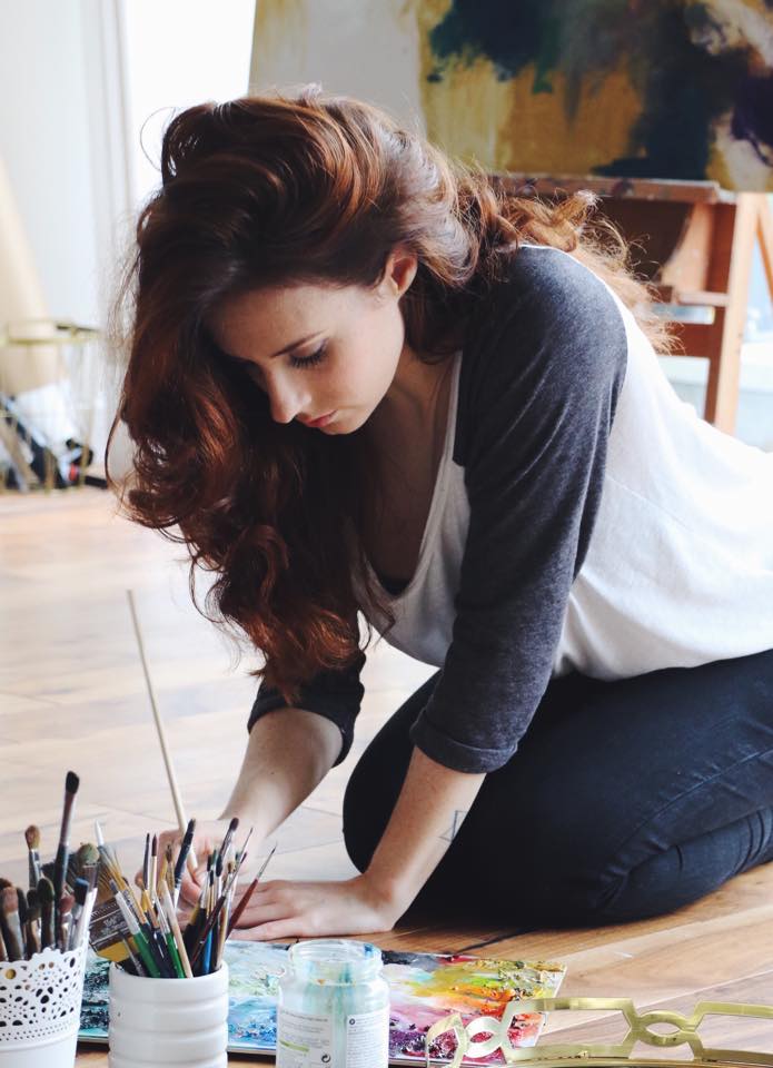
To help me shape this Pandora’s Box of a topic,  I have spoken at length to other artists and people who work with their own creative content. This scope is large and can span over many varying careers. But the answer we all seemed to agree on was the same. In the nature of all creative content, originality is a fleeting concept. If the idea has already been done unbeknownst to you, then it may about to be done, unbeknownst to them. This is my perspective, with opinions peppered through that I have learnt along on the way to writing this.

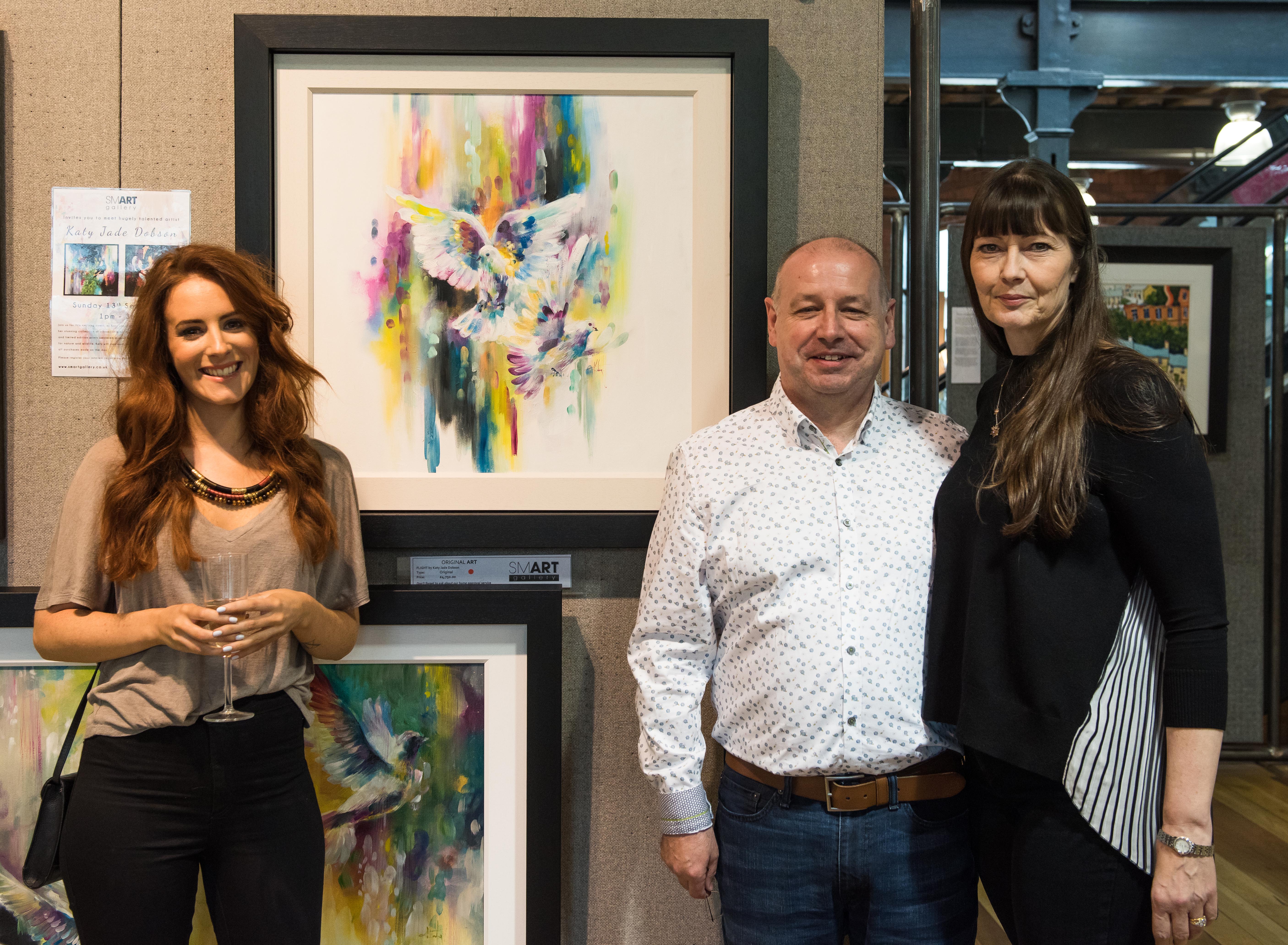
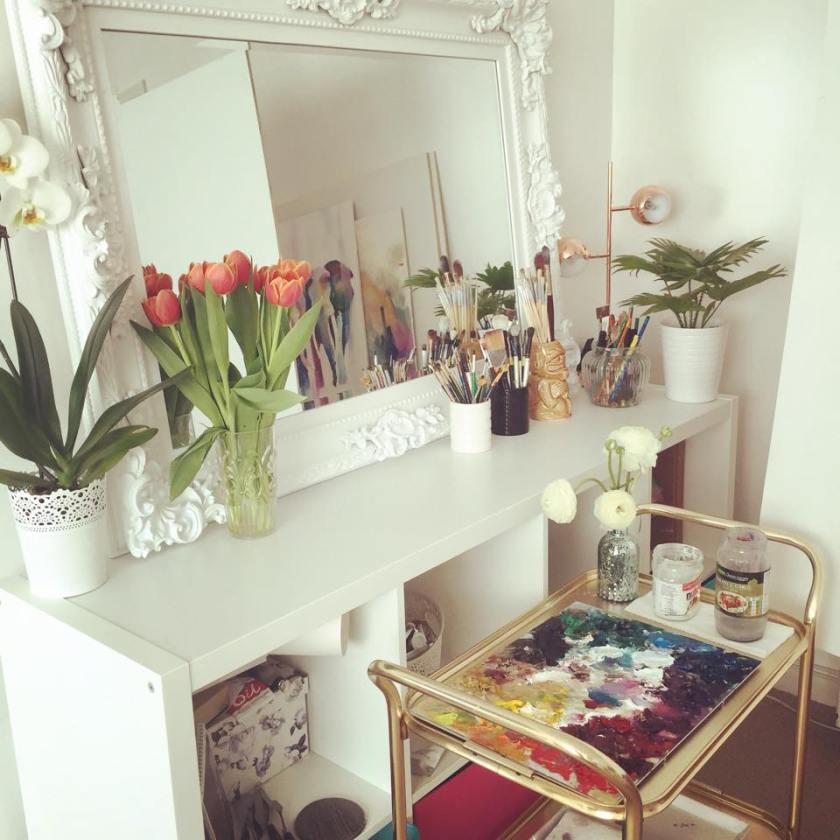
I began using this blog as part of a project for my 3rd year of my Art Degree; under the instructions to show that you could create an online space that held information about your work. I noticed that I could increase the footfall towards my page. Then in 2013 I took social media platforms more seriously after finding them to be a great place to share my paintings and garner views and interest in my art. As the following increased on Facebook, Instagram and Twitter amongst others like Pinterest and YouTube that there were many advantages towards having your work set before a big audience, but only one pitfall.

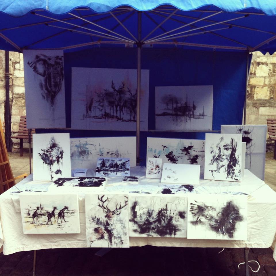
 Immediate feedback and interactions have been priceless and add such a fun element to my work. I get to connect instantaneously with like-minded art fans from around the world and hear their opinions and see their own creations. We can talk about which materials work better for our purposes; we can share tips and great conversation. On a larger scale I can tap into my statistics and inspect traffic and engagements. Immediately I was able to see the correlations between certain paintings and their reaction on social media. I was able to notice patterns, fluctuations and spikes. I learnt what worked and what didn’t. I was able to sample test my own new work like a comedian trying out his new material to an audience.

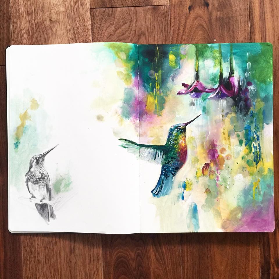
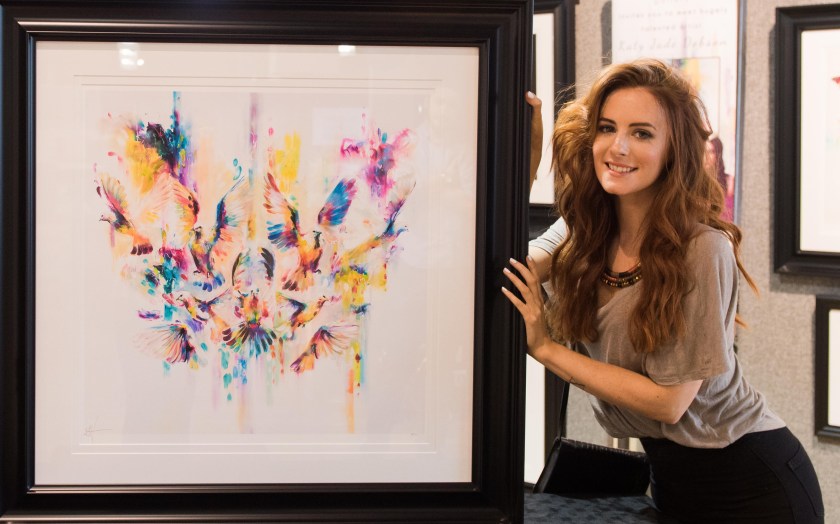
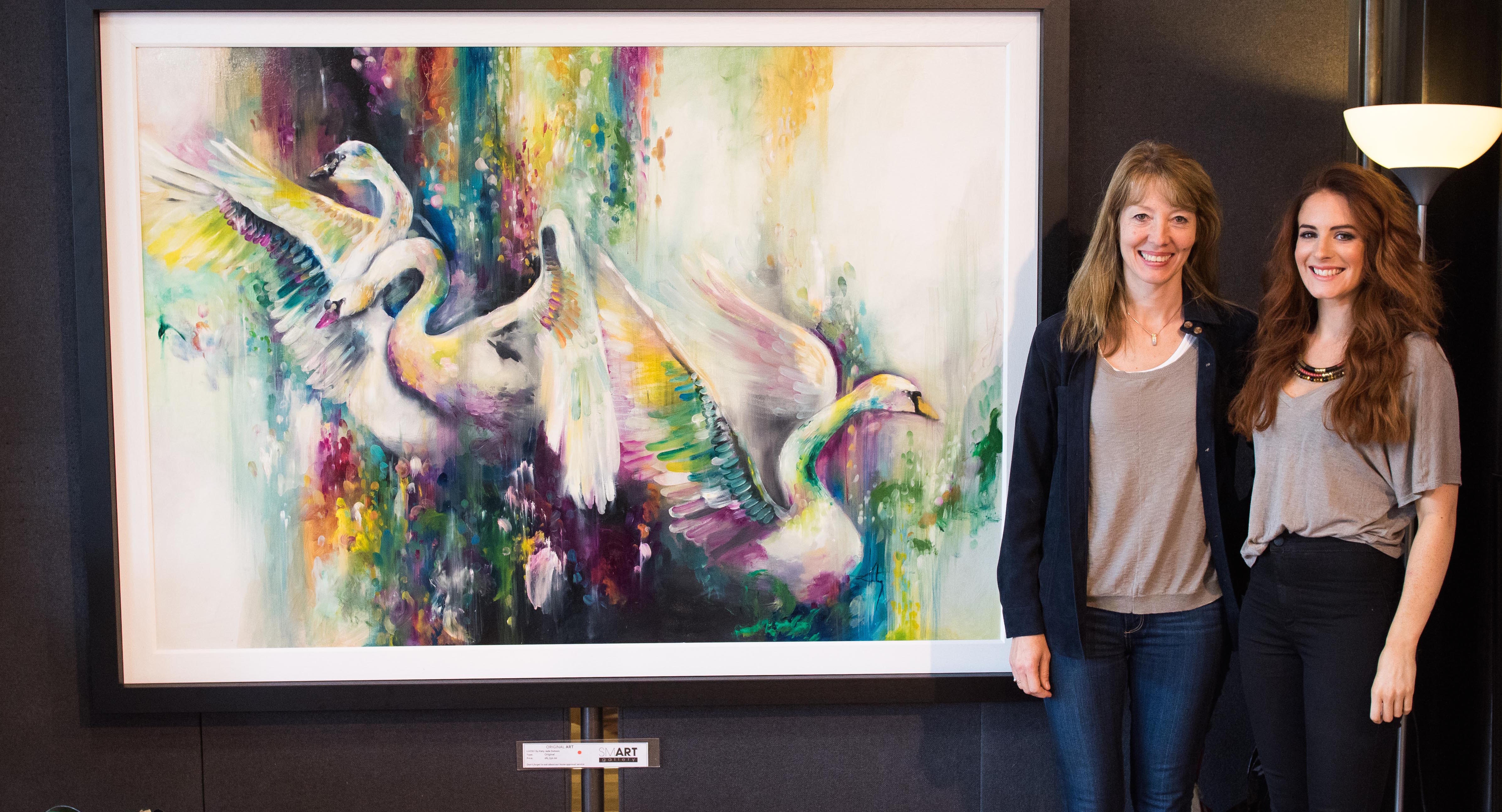
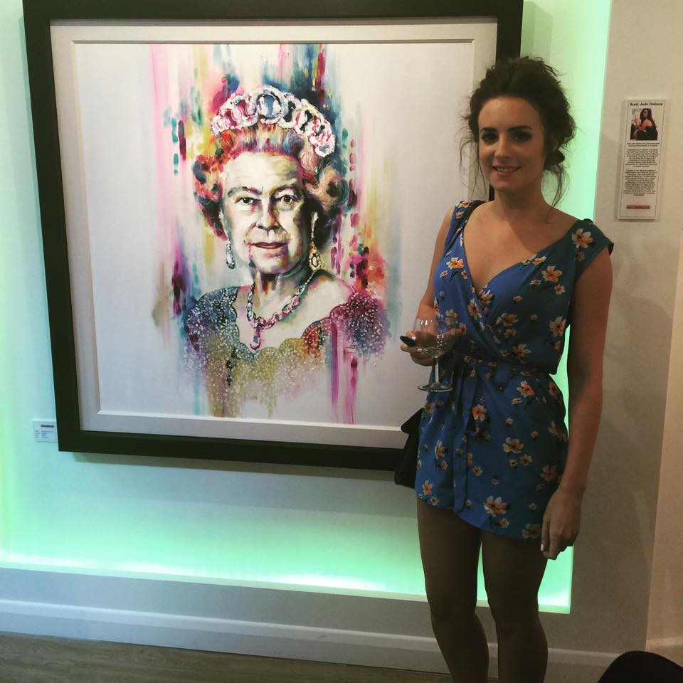
Another beautiful part of sharing your work online is to see it recreated through someone else’s eyes and capabilities. I am often tagged in images of a painting of/or based on one of my own originals, citing me as the source and showing me their recreation. This is overwhelming to see. I never imagined I would see the day that someone used my work as a reference to learn from and to reach the same end game in recreating my painting.

There’s just one small Con that sits by itself amongst all those incredible Pros.

 Plagiarism.

ˈpleɪdʒərɪz(ə)m/Submit
noun
the practice of taking someone else’s work or ideas and passing them off as one’s own.
“there were accusations of plagiarism”
synonyms: copying, infringement of copyright, piracy, theft, stealing, poaching, appropriation; informalcribbing

In most trades, learning new techniques must come from a form of copying. It can be helpful to make your own attempt at creating the same style to get a grasp on it. Here there lies no ethical issue. In the same way this practice of recreating a piece may come from a place of appreciation for the painting you want to recreate, there is also the benefit of learning along the way. Gaining these skill sets of the person you admire by your own trial and error.

Where is the line?

An opinion I found to be common with artists is that there are two lines. One begins at not citing the original creator and passing off a blatent recreation as their own. The other is monetary gain.

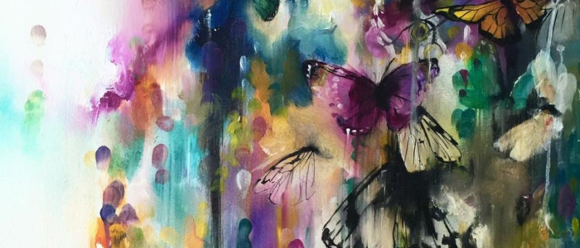
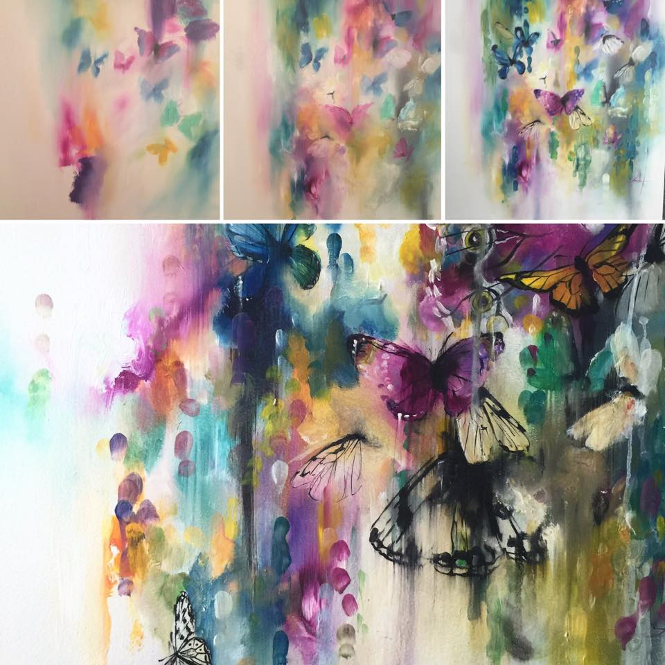
 I have been forwarded to many accounts on Instagram that are full of pure recreations of my work. This I love to see. My soul lights up to see the effort and skills learnt that I had to learn before I could create the piece myself. A common theme I found to be infuriating at first was not announcing that there was ever an original artist and calling the work to be their own. I felt infuriated at seeing a piece where in my own original version, the drip mark happened accidentally and I left it in, only to see the carefully placed line where the drip was recreated in someone else’s. My annoyance at these accounts was short lived. Now I enjoy seeing them, they highlight the points that someone else sees in my paintings and focuses on as an area of importance. I find them helpful and enjoy seeing their progression, as I also have progressed. On a smaller scale there are accounts where people are just ‘close to the bone’ in their recreations. I have found that these ones often anger artists more than others, (especially when financial gain for the copier is involved) as their ethical stance is more protected than an obvious copier. I found myself infuriated at this on a couple of occasions, but again it was very short lived. I understand enjoying someone else art and wanting to be able to create the same marks and effects as they do. A perspective that over protective artists sometimes don’t take, and understandably so. They are not just protecting a finished product, they are defensive over their process, their ideas, their labour and then the finished product. I see both sides.

The reason it doesn’t affect me as much is because I still see the process as mine. A finished piece might be recreated, and possibly to a high and beautiful standard! But when I see these pieces I also see what the re-creator has missed…

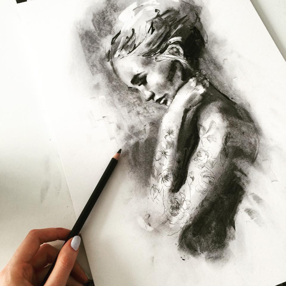
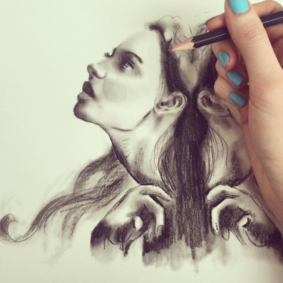
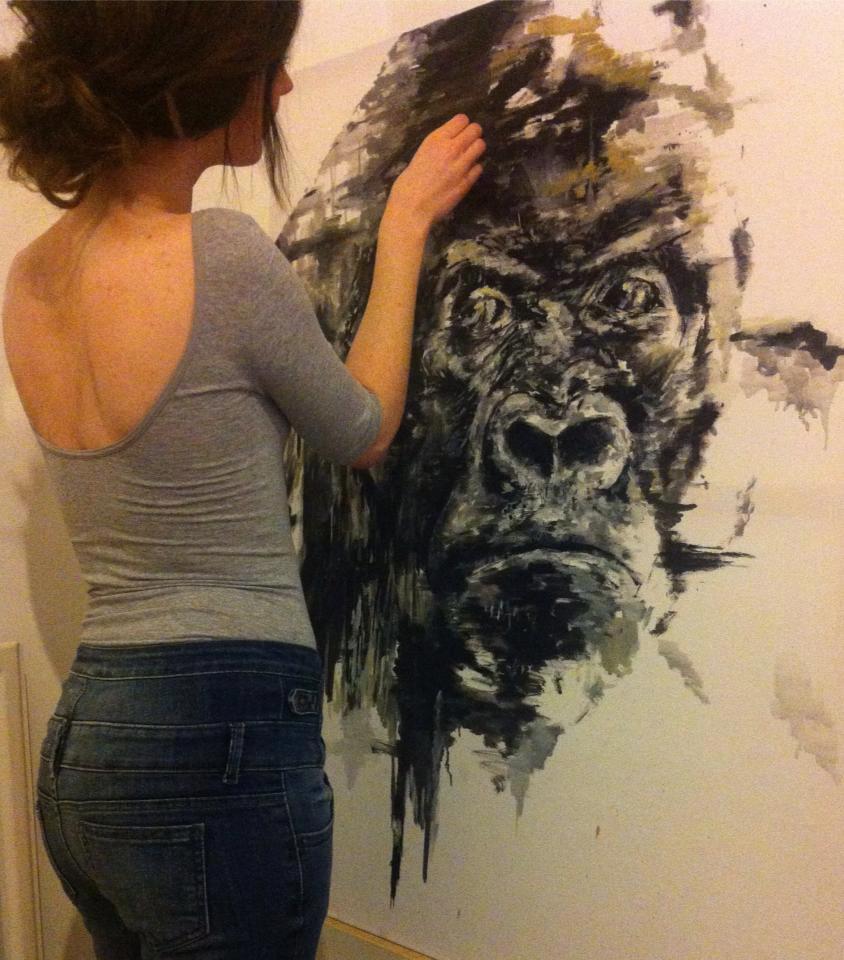
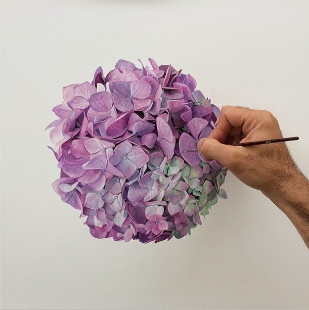
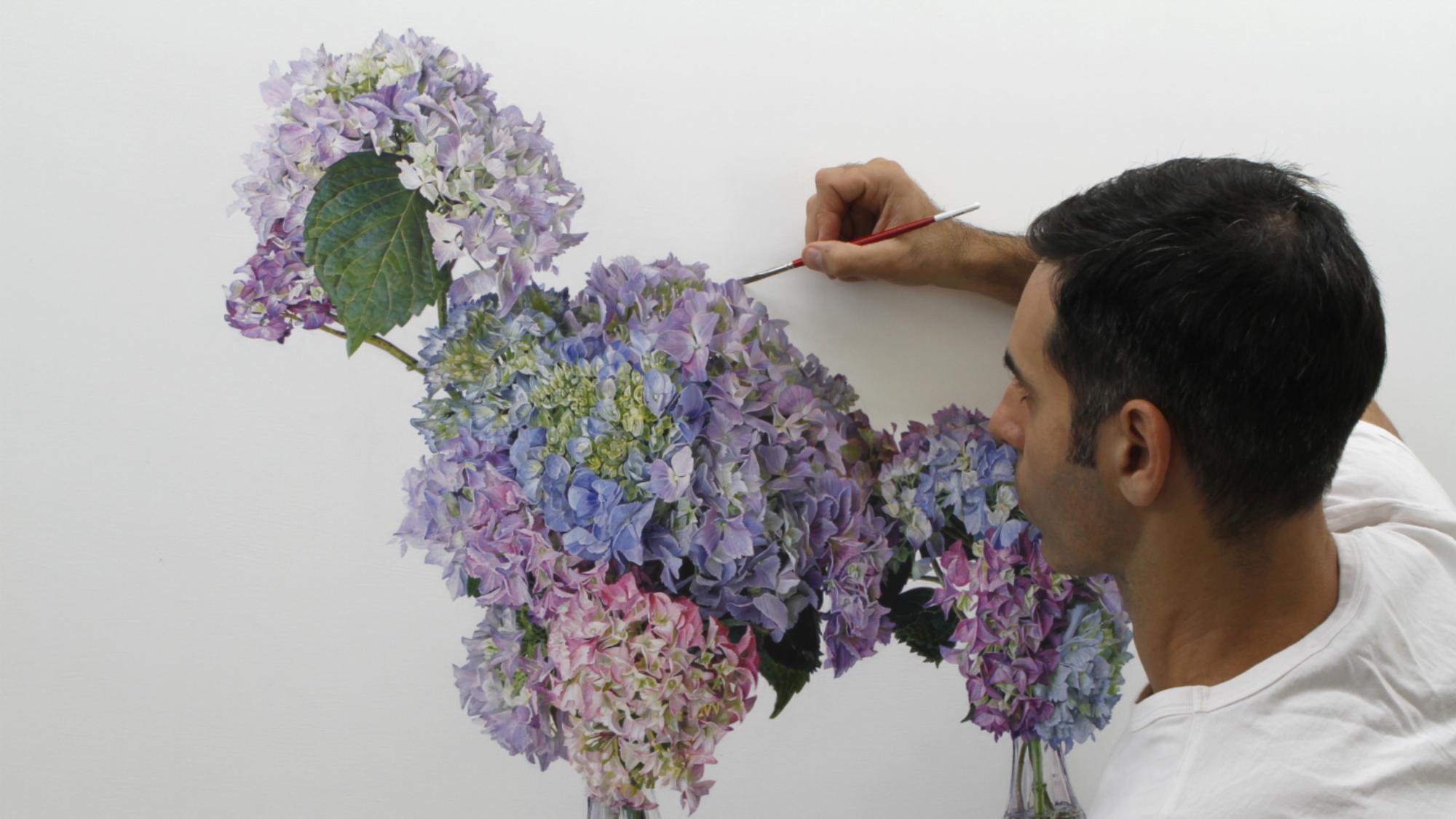
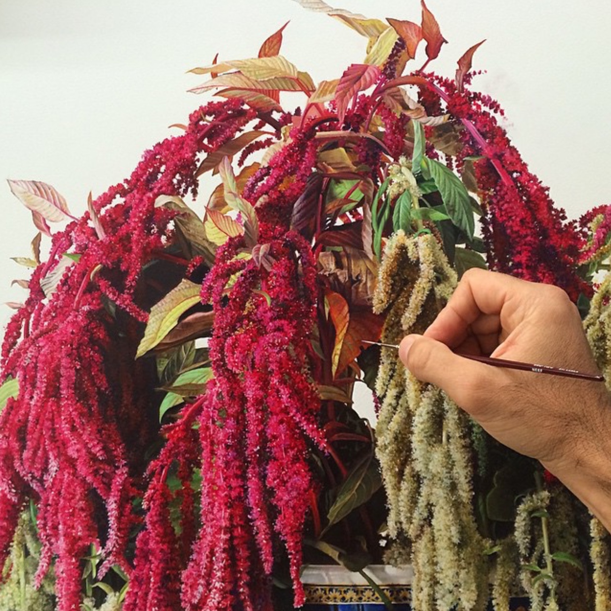
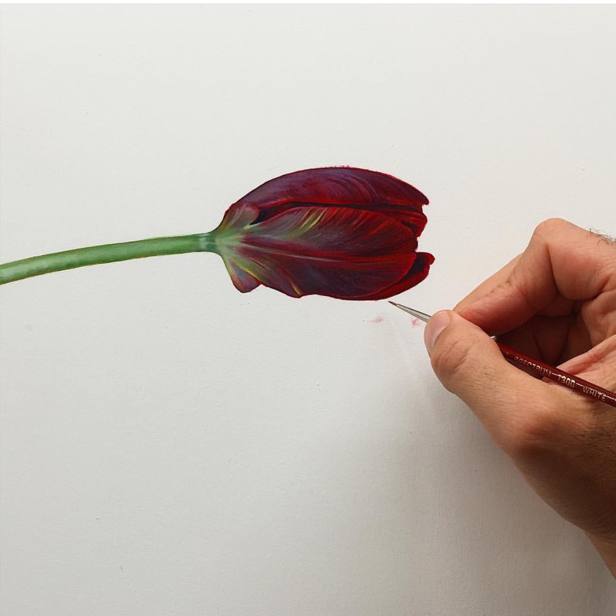
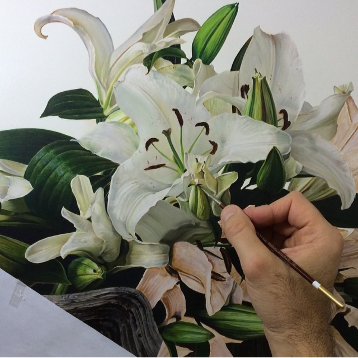
As an artist, welcoming your new ideas is a moment where lightning strikes. It is very exciting; late nights ensue and pages of A4 are scrawled over as hastily as possible to ensure all of the imagery in your head will make sense on paper incase the idea slips away. Your idea might be compositional. Maybe you could weave in that colour palette you thought of last week? The subject needs to be definitive but maybe you could tweak the backgrounds to fit the new amazing idea? Maybe incorporate the balance of that old masters painting you love and make it relevant to your idea? This whole process is enormously important and one of the best parts of creating something, bar seeing the finished product. There is a wonderful energy of excitement and an eagerness to set the wheels in motion and make it real. Copying is missing out on the process of finding your own style. Time spent reproducing something done before (often with slight changes to attempt to justify the ethical integrity) is still time spent not doing something that will further your own artistic way.

An artist or anyone who creates their content for a living may feel that a ‘copier’ could impact on their career, but the truth is it doesn’t. In the most extreme circumstances, the person plagiarising is aware of an impending backlash with the integrity issues they may come to face. It stunts their growth as an artist. It is also illegal.

Advice I have been given and have learnt in discussions over this post is that the artist being copied remains intact in their integrity and abilities. Their work can be attempted to be copied but it can’t take away from the artist as a whole, as a recreated finished product doesn’t account for the stepping stones that took you to your own unique content that you produce today. These stepping stones can be viewed in your backlog of work which show your journey over time. My work is a culmination of years of finding my footing, working to figure out how to apply to get the finish I am looking for. This personal process can’t be plagiarised.

Be flattered. Passing an influence is a beautiful thing. You should be proud over frustrated. Remember that your process was never encroached on. Only a finished product. The visual of a finished product is only a small percentage of the whole process.

12074809_968655539863858_7960012109374011444_n

‘Flutter’ Limited Edition Prints

A common question that I am asked is the distinction between ‘finishing or abandoning’ a painting (in terms of completing work) and which one applies to me? 

There are two very different feelings when a painting is complete and is at most an unpredictable part of the process for me. Occasionally my idea is crystal clear enough to see when the finished version is in sight, or be unable to stop until I meet this mark in my mind. This is finishing the work that you set out with a cause, process and visual in mind.

Abandoning the painting is a very different but equally as satisfying feeling, in when you reach a stage in the work where you feel it is right to stop. For whatever reason, it may be that the balance is right and anything more could be overworking it. Maybe you feel that what you are trying to put across has been successful and in going further could potentially spoil that. A number of reasons, even just that it ‘feels’ right to stop could cause for you to purposefully abandon a painting.

‘Flutter’ for me was a small scale painting that was initially started as a way of playing around with composition, textures and movement. I didn’t intend for this painting to materialise into a finished piece of artwork that I would happily sign my name to, gloss and pass over to be released as a limited edition print. It was a blank board that I intended to use to practice on. This led to me to believe that part of the enjoyment of creating Flutter was in the zero expectation from myself or anyone else. There was no question of room for error, there didn’t need to be a right or wrong, no time scale, no rush, no boxes to tick. This light playfulness leant itself to the nature of the subject I was working with. After spending some time playing around with this painting I let it sit in my work area for a while as I figured out what to add to it next. With this in mind I decided I did not want to add to it, or take anything away. It was clear to me that I aught to sign and abandon so I couldn’t tamper with the ethereal lightness, mixed with the erratic movements that I felt I could see through the painting, and complimented the nature of a butterfly darting around. With Flutter it was a case of abandoning with full satisfaction that it had naturally appeared at its correct finishing point.

12038488_959984514064294_4002030682318400047_n

As with all subjects that I work on, it begins by flicking through as many images and videos as possible. Videos of movement can show you a lot about the way the animal is built to manoeuvre, which then tells you more about its capabilities in the wild and what it can or can’t do. Movement is the most important thing to consider even if the animal is stationary. The way a stag might sit or lie down still provides a use of muscle which will show varying definitions which are important to make the stance look believable. With something as airy as a butterfly, the action is part of the essence. If these qualities are not captured then you’re not catching the soul of your subject, but just transferring its physical appearance to a canvas.

 My research led me to find that a butterfly wing is made up of minuscule scales. These scales hold the colour but not in the form of a pigment. The scales are arranged physical structures which react with light to create the colours we see. With butterfly wings much like bubbles, films of oil or mother of pearl, and other iridescents the colour depends on the angle it is viewed at which means the colours are created by an optical effect based on refractions and diffractions of light. Imagining these built up scales can draw many parallels in my mind of sections of artwork that I embellish with heavy, layered and multicoloured brush strokes. Close ups of these wings are just like an abstract art in their own right.

a877856e55167c5e847dac437129a93163145f2c

After establishing the points of interest that I felt would be important to build up a painting depicting butterflies and their chaotic/light tendencies, alongside the intricate structure of their wings which create the incredible colours they display naturally,  I then without restrictions and just for fun worked on this piece until it felt right to abandon.

‘Flutter’ has been incredibly popular which was a big surprise to me, and one that has been requested repeatedly to be made into a Limited Edition Print, which was launched recently at Smart Gallery. To find a stockist for this piece go to my website www.katyjadedobson.co.uk and look for the affiliated galleries. For help finding a gallery close to you that may stock this print, you are welcome to send an email to info@wishboneart.co.uk

12039235_961489913913754_8993590091370731537_n

‘Talent is a pursued interest’ / My Personal Artistic Evolution

A few years ago I had never painted with oil paints. I used paints (watercolour or acrylics) to splash some colour onto my mainly charcoal sketched pieces. The image below shows the work I had for sale at a stall in an art fair in 2012. After a closer look I saw so many familiarities with the work I used to create and what I paint now. There are abstract birds in flight, loose portraits, proud stags, elephants and dripping florals. I realised that your work doesn’t change over time, it only evolves as you progress.

11163741_897360296993383_7581062901031940038_n

My decision to move to oil paints was based largely on the opportunities that they hold with colour. Being such a malleable material with so much depth to play around with, you can create any style or look that you want to achieve with the right techniques. Back before I taught myself to use oil paints I loved incredibly loose work that oozed energy and movement above all else. I wanted to show the construction marks and leave them raw and exposed, whilst building up certain areas into more detail. I began as just a draftsman, drawing only to improve, but not to create something. However the need to make something of my own followed quickly as I shifted from drafting straight into abstract wildlife/portraiture art. Teaching myself was the most important thing I could have done for the development of my work. Not only does it give you a better understanding of the science behind the materials you are using and how they work best, but you are testing and failing as a way of developing. Leaving your ego at the door and working on something you are unhappy with, only to relentlessly turn it into something you adore, I have found it my best style of learning.

 – ‘Talent is s pursued interest. Anything you are willing to practice, you can do.’ – Bob Ross (#LEGEND)

In a way I have continued this process into the work I create currently. I look back over my work from the previous few years and see so many stages of growth and new skills leant, but also it shows that although your skill set my change and adapt, your own style is hard wearing, withstanding the changes you naturally make as you develop your work. Your style is what makes your art your own.

I have sifted back through my images from the past two years to find the best comparisons for how my work has evolved over time. (My favourite comparison being the bird pieces..)

2012

2012

2014

2014

2012

2012

2014

2014

2012

2012

10499603_777894278939986_3289884990995069564_o

2012

2012

2014

2014

2013

2013

2015

2015

2013

2013

2015

2015

2012

2012

1521828_815016211894459_2351043638893386364_n

2014

There are so many more comparisons I could have made. My favourite thing about looking back at old work and being as critical as I currently am, is remembering how happy I was with it at the time. Even when now I see so many flaws. If you are creating content based on your own personal preference of when you deem it to be finished, it means you work only to be critical of yourself. It is a great reminder to look back and remember how much work I put into developing my style, learning the techniques along the way to portray what I felt I need my work to say, and finding my footing everytime I sit at the easel. I don’t believe anyone can fully become accomplished in their field, there is not race to be the best. I believe it is only about evolving.

Micheal Zavros / Inspiration

Just a quick internet search can tell you that there is no end to the amount of talented artists in the world. Instagram in particular has been great for unearthing these exquisitely talented humans who happen to document their creations and I love to ‘follow’ them.

There is an infinite amount of inspiration that you can gain from looking at and enjoying the work of others, without copying/plagiarising. (A post about this topic in particular to be uploaded soon..) Taking inspiration isn’t about stealing, or at least shouldn’t be! It is noting the feeling you get when you see a particular piece of art and translating that into your own work in your own way. A painting might have an electric energy with movement that leaps out at you. Another might have solemn or moody overtones that gave you a sense of atmosphere when you looked at it. It is more often than not the ‘vibe’ of the painting that you most likely enjoyed. Inspiration should be transferring that feeling/vibe/energy in your own way, to your own style in your own work.

Alternatively, inspiration from the art that you would hope to apply physically should be small ‘moments’ within the art. There might be a certain mark, or a way that a colour is blended. Even a certain colour palette that you could note and use in a section of your work. Adding all of these small inspirations together is what can make your own art and your own unique style. That and so many other qualities that are personal to you. (The way you hold your pen, the pace you work at, the materials you use, everything contributes to an individual style)

I would consider it an important part of my ‘process’ to sit down with a coffee and my iPad and look through tags such as #art or #oilpainting and watch what people have been creating just that day. I stumble upon both hugely inspiring artists and people starting out and making progress, which is amazing to watch. I find inspiration in seeing techniques first hand and learning about the kinds of materials that others might use for a different finish. To garner together this sort of inspiration in the same way you would gather information means that you can project your own potential as to where you could be if you continued to work hard and become more seasoned in what you do. You can also learn to let go of seeing the creations that are dissimilar to your own choice of style as something you dislike. This is done often by many. If you can step away from your own work and appreciate the work of others as something you can’t do (without jealousy) or something you don’t understand (because you don’t need to) and instead just appreciate the time and talent that goes into it, then you will benefit hugely in considering how your own work might be viewed.

One of the artists I have found a lot of inspiration in is Michael Zavros. An Australian painter with a number of awards, exhibitions, residencies and reputable commissions under his belt. His intricate floral paintings in particular are so realistic its hard to believe they’re not a photograph.

My work is completely different to Zarvos’s, but I have taken some inspirations through following his instagram page, mainly his concentrated composition. I adored the serenity of his work and from observing his style I saw he kept his backgrounds very crisp and clear. His work is so finely detailed that it clearly didn’t need any overpowering backgrounds, but it adds so much to the finished effect. I find his paintings mesmerising to look at. Although I haven’t left my backgrounds as crisp as his nor ever worked in hyper realist detail, I felt inspired in some pieces to keep my backgrounds as ‘quiet’ as possible to direct attention to the areas I wanted focusing on.

I find photo realism to be an intense experience to look at, I have so much admiration and appreciation for the techniques that go into creating something of such accuracy. Zavros’s floral paintings are not only proportionately perfect but the colours and tones are all as close to real as the real thing. The sheer amount of careful effort overwhelms me.

mz5

the-mind-blowing-talent-of-artist-michael-zavros-1430466294

IMG_7139

IMG_7140

IMG_7141

I LOVE this guys work, and so many other artists. Instagram/Twitter/Pinterest are all great ways of finding artists to fall in love with and to be inspired by. The creative process doesn’t always have to be a completely brand new idea, it is not shameful to credit the people who influenced certain sections of your creative journey towards a finished piece which then actualised into something that is indeed your own unique style. There are millions of artists you haven’t yet uncovered who might shape a huge part of your style. And if you haven’t already go and look at Zavros’s work…


Jellyfish Art / Oil Painting

It took a lot of preparation before I decided to take on jellyfish as a subject for an oil painting. Before tackling the big decisions you make before you start a painting (composition, texture, colour palette, tones etc) it seemed important to get a better understanding of jellyfish. Are they often alone or in groups? (Which I found to be named a ‘Plume’ when they migrated and gathered together) How do they move? At what speed? What different positions would you find their tentacles to be in? And which movement does this represent? The only way to really find out was to watch them, thanks to YouTube!

There is something so peaceful and mesmerising about watching jellyfish, the way they pulsate their gelatinous bodies for locomotion and the tentacles fan out so elegantly. It was apparent immediately that the movement was the most important aspect to capture within a painting.

For the fished pieces ‘Bloom’ and ‘Plume’ I used oil paints (as always) onto primed wooden panels. The most interesting part of the process for these paintings were that they came together incredibly slowly. The tentacles, I always knew, would have to be the final part to paint due to their slenderness they would have to be painted onto a dry background (so as not to drag the background paints) meaning that there was an unfinished quality throughout the process. The application of the tentacles suggested direction, pulsation and fluidity which is the core visual you associate with jellyfish.

‘Bloom’ / Oil on wood panel / 47×47″ inches

'Plume' / Oil on wood panel / 30x30" inches

‘Plume’ / Oil on wood panel / 30×30″ inches

Both of these originals were exhibited at Smart Gallery (WEBSITE HERE) – contact for information. (‘Bloom’ sold) Where I spoke to lovely people about the strangeness of jellyfish and the process of painting them. The imminent release of ‘Bloom’ as a Limited Edition Print, a piece that was featured in British Vogue Magazine, meant that Smart Gallery have had exclusive access to the first prints, available to their clients for the exhibition of my work. Being an incredibly popular piece, it is great to see it available in a true to life print format, made accessible by fantastic galleries. A wonderful extra for the day, was the showing of framed original sketch studies, drawn to plot out compositional ideas for the originals.

12011357_953782171351195_8505945561086802983_n

11923268_945581135504632_8708023810270807005_n11999040_948939058502173_7825865338207766894_n

For any information on these originals, new Limited Edition Prints or original framed sketches head straight to Smart Gallery or their website (link here) to inquire. 

Keep an eye out for new releases and photos from my recent exhibition!

‘Life Imitates Art’

In the age old debate of what came first; the chicken or the egg, I find myself deep in a philosophical tangent inspired by a late night online shopping purchase. I bought a necklace that gives the impression of an elegant snake coiled around the neck. Unappealing to some, beautiful and ethereal to me. This internal debate reminded me of a quote from Oscar Wilde – ‘Life imitates art far more than art imitates life.’

My exact reason for clicking my purchase straight over to the checkout was because it reminded me of a painting I did in my last collection (The Phosphenes Collection) which depicted a bizarre image of two symmetrical women holding up snakes, which are coiled deliberately around their arms within the confines of the symmetrical intension. (Original piece shown below / ‘Serpens’ oil on wood panel)

17630_871240099605403_9053442852693390586_n

This is one of my stranger pieces, this and ‘Nectar of the Gods’ which I also hold an unhealthy emotional clingyness to even after sold and gone. The reason behind loving these stranger pieces is the idea of using wildlife as symbolism, instead of a standalone subject. (To which I also LOVE to paint to emphasise their magnificent natures in their own right) But I also think people take different inspirations from varying imagery. Dream interpretations would say that the presence of snakes in your subconscious shows an underlying threat. Something to be wary of. A ‘snake in the grass.’ Ancient symbolism would boast meanings of good and evil, fertility or poison, vindictiveness or guardianship.

To me the imagery of snakes has always been an almost opulent experience as it suggests to me The Garden of Eden which provokes thoughts of lush, bountiful gardens. (A subject I already touched upon over a year ago as a personal project to decorate my bedroom, which of course features a coiled snake…)

10390134_725837830812298_932734223334879212_n

Have my  fashion choices been inspired by my own artwork? Or was my artwork inspired by what I had already taken a likening to? Where does the circle begin and end or are we in a perpetual state humming with the imagery, ideas and inspiration of the the things we love in life?

I don’t know, inspiration is a fascinating thing as it propels most actions that we take. The inspiration to exercise, to create, to want to tidy the house or earn money. All things we act on come from a place of inspiration behind the action. But thats another philosophical tangent…

11694973_920503471345732_8333040135900115789_n

Artist’s Palette / CRY Auction

My palette was auctioned last week for the amazing charity CRY and sold for £1025! I am so happy and incredibly proud that it will contribute to such a great cause! A link is HERE for my last post where I go into more detail about this charity and about the palette donated.

For more information on CRY and what they do follow the link HERE to their website, or to donate towards their cause click HERE.

Thank you so much to anyone who bid!!

Artist’s Palette up for Auction for charity CRY / Katy Jade Dobson

I am incredibly proud that the palette I used while creating my Phospenes Collection is now available to bid on to raise money for the wonderful charity CRY.

11026289_913491145380298_1249971978102286108_n

CRY is a charity based around Cardiac Risk in the Young and supports those affected by sudden cardiac death. Undiagnosed heart conditions take the lives of at least 12 young people every week, a number in which this charity is aiming to lower through their fantastic research and prevention efforts. 

I was made aware of the work of CRY through a private commission requested by a family who had lost their child to a cardiac condition.

It should never be the case that a child or anyone should lose their life so suddenly over something that could potentially be diagnosed earlier on, CRY’s incredible efforts towards Young Sudden Cardiac Deaths with their research, raising awareness and prevention efforts in this field are life saving. The care and facilities to aid families affected by YSCD will continue to help so many people who desperately need it. To hopefully contribute towards CRY’s wonderful work means a great deal to me, I have so much admiration for their relentless efforts from making screening accessible to organising Bereavement Support Days. I am incredibly proud to be working with CRY towards this cause. (Read more about CRY here)

The palette and signed brush have contributed to a number of huge paintings, and have been the tools of creation for my latest body of work The Phospenes Collection, which housed sell out limited edition prints, many sought after originals, and some of my favourite pieces I have ever worked on. (‘Nectar of the Gods’ and ‘Wingspan’ to name just a few)

10257681_869257926470287_2077321221125773724_n

10516780_868243123238434_8754943545124560694_n

I have written at length about palettes and the way they can be almost telling or reflective of an artists style or vision. I format my palette as a colour wheel, something I know isn’t always the way artists go about it. However with my pure greed for colour, setting up a palette is not a game of tact but instead an opportunity to have every single colour, shade and tone at my disposal in one place. My palettes as I use them over time become heavy from build up, messy from overuse, but drenched in depth and character. I become almost as attached to my palettes as I do my paintings. The accidental shades mixed together can inspire a whole section of a painting. The colours can encroach on another shade’s territory and create colour matches of their own. The palette is truly the heart of my work space.

The palette is where it all begins for me and to close off a collection with signing off the palette is always a very profound moment, and it is incredible to share that and also hopefully raise some money for an amazing charity that make such a huge difference to many people.

If you have any interest in bidding for this palette and signed paintbrush and contribute to a wonderful charity then click HERE – Or to donate directly to CRY click HERE

11109185_881651265230953_7858586285929031220_n

Thank you for your continued support, it is always overwhelming and so appreciated!