
Parallel to overseeing my exhibition (still running for one more week) I have been working on commissioned projects including this royal blue stag painting.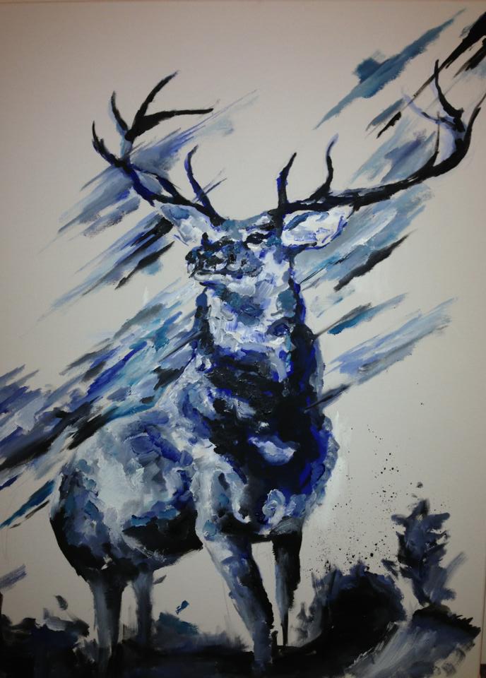
When being asked specifically to work in one colour I automatically thought this was a slight restriction that could potentially suppress a lot of the natural character that could be captured in a wildlife painting. However I decided to take it on without reservations and find other ways to inject character. The palette I was asked to used was ‘royal blue’ which in itself could well portray the pride of a stag. I decided however to minimise the use of royal blue and begin by building darker and lighter tones of this blue until I had the basic stag. The royal blue I then added as a highlight. minimal with the idea of brightening, suggesting and ultimately setting the tone of the piece itself.
I am still working on this piece and I cannot wait to see it finished, it is a personal favorite of mine and a challenge in following the guidelines.

GORGEOUS! Love the colour scheme and textures!
-JH
Congratulations. You have got the head and shoulders just right here. Looks good.