All posts tagged: love

Laura Jones / Still Life Artist / Inspiration

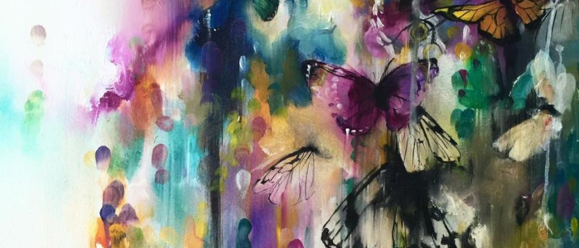
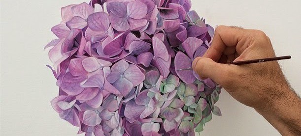
An artist I have admired for around 6 months via the stalking platform of Instagram, is Australian painter Laura Jones. I stumbled upon her Instagram page (@_laura_jones_ ) and immediately followed. With a meaty backlog of exhibitions, shows, awards and residencies her accomplishments have been as full as her engaging artwork. Although I love her whole back catalog of work including a portrait series titled ‘I woke up like this’ my favourite is her recent ‘Wildflower’ work which emphasises an expression of Australian identity. I find her work so warm and peaceful. The colour patterns are incredibly earthy while retaining the brightness of the flowers and vases. They are full and bold in application but soft by nature. I identify most to the tactful naivety of the brush strokes as well as the simplicity of the visuals. I very much hope to own one of these originals! This is the kind of artwork that I feel doesn’t need discussing at great length, it should be looked at and examine how you feel when you see it above dissecting …

Virtue – A painting ensouled

It has so  far been rare that I connect to a painting that I produced quite as much as I did with Virtue: a light and ethereal take on a flock of doves. I enjoy working on every painting, some I would keep for myself and some I couldn’t wait to show the world and allow someone else to connect. Hoping for others to connect with your artwork is a pointless effort, it can only really be seen as you would like, if you paint with the intentions of making yourself feel a certain way. Only then, maybe someone else can channel into its meaning or create their own. I love this about art. Production based from feelings gives a timeless result to the artist. ‘Virtue’ came together incredibly fast for a painting of its vast size but tricky and slight proportions. It is often the case that when working so close to a large scale painting, you can become lost in the finer details, only to be surprised by what you produced when stepping away. It can …

Exhibiting at Robertson Fine Art Gallery

In the heart of Edinburgh, in the wonderful Robertson Fine Art Gallery I had the privilege of exhibiting my new collection of oil paintings. I had been working on this group of paintings throughout early 2016 and became quickly engrossed in the collection as a whole. I tailed off into new sections, irrelevant subjects that still laced in throughout the main body of work and played around with more muted palettes and ideas alongside hugely embellished subjects . To see more of The 21 Grams Collection, see the work and read about its origin – click here. I was incredibly nervous to be showing this work. It had been months of dedication, hoping to put my best foot forward to prove to myself that I can challenge my own techniques and build on what I already know about painting to create the marks and flourishes that I needed. I taught myself new approaches through trial and error and got lost in a concept of building continuously until I had reached the desired effect. So much so, …

The 21 Grams Collection / Katy Jade Dobson

21 Grams A painting is the artist’s sigh on a canvas, the silhouette of their shadow, and their 21 grams. An early 20th Century physician hoped to measure the mass of the human soul. He believed it to weigh 21 grams. Thought to be as real and prominent as a vital organ, yet no physical attributes could be found. Artists and scientists alike hunted for information on the location of the soul in the body to find that it rests on nothing seen by the eyes. This ideal that represents an entire being does not exist in physicality, yet we see it. Each piece is an appreciation of it’s subject and a love for my inspirations. A collection ensouled and a moment in time captured in a prism, reflecting my everything onto a canvas. Physically, this collection is about texture and atmosphere. Years of techniques, new avenues and an ache to work on my subjects in such a way has driven the visuals of the paintings forward. Finding the best translation for the essence of …

Frequently Asked Questions

I get asked a lot of questions at exhibitions or through social media. Although I try to catch up on responding to comments, there is currently a lag. As a way of answering some of the very commonly asked questions regarding me and my work, I have compiled a list of FAQs to answer some! What materials do you use? I paint in oil paints. A few years ago I tried my hand at mixed media work, and have also dabbled with watercolours. Aside from my sketches (which are mostly charcoal or graphite) I work exclusively in oil paints. Oil paints are given a stigma for being difficult to use. Too thick, too hard to use, too long to dry… etc. This depends on how you paint and use your materials. For me, oil paints were the only option in moving forwards with my work, the traditional and classic tools for painting. (In my opinion) Because I had my heart set on painting with oils, I figured out how to make the material work for …

‘Flutter’ Limited Edition Prints

A common question that I am asked is the distinction between ‘finishing or abandoning’ a painting (in terms of completing work) and which one applies to me?  There are two very different feelings when a painting is complete and is at most an unpredictable part of the process for me. Occasionally my idea is crystal clear enough to see when the finished version is in sight, or be unable to stop until I meet this mark in my mind. This is finishing the work that you set out with a cause, process and visual in mind. Abandoning the painting is a very different but equally as satisfying feeling, in when you reach a stage in the work where you feel it is right to stop. For whatever reason, it may be that the balance is right and anything more could be overworking it. Maybe you feel that what you are trying to put across has been successful and in going further could potentially spoil that. A number of reasons, even just that it ‘feels’ right to …

Micheal Zavros / Inspiration

Just a quick internet search can tell you that there is no end to the amount of talented artists in the world. Instagram in particular has been great for unearthing these exquisitely talented humans who happen to document their creations and I love to ‘follow’ them. There is an infinite amount of inspiration that you can gain from looking at and enjoying the work of others, without copying/plagiarising. (A post about this topic in particular to be uploaded soon..) Taking inspiration isn’t about stealing, or at least shouldn’t be! It is noting the feeling you get when you see a particular piece of art and translating that into your own work in your own way. A painting might have an electric energy with movement that leaps out at you. Another might have solemn or moody overtones that gave you a sense of atmosphere when you looked at it. It is more often than not the ‘vibe’ of the painting that you most likely enjoyed. Inspiration should be transferring that feeling/vibe/energy in your own way, to …

Jellyfish Art / Oil Painting

It took a lot of preparation before I decided to take on jellyfish as a subject for an oil painting. Before tackling the big decisions you make before you start a painting (composition, texture, colour palette, tones etc) it seemed important to get a better understanding of jellyfish. Are they often alone or in groups? (Which I found to be named a ‘Plume’ when they migrated and gathered together) How do they move? At what speed? What different positions would you find their tentacles to be in? And which movement does this represent? The only way to really find out was to watch them, thanks to YouTube! There is something so peaceful and mesmerising about watching jellyfish, the way they pulsate their gelatinous bodies for locomotion and the tentacles fan out so elegantly. It was apparent immediately that the movement was the most important aspect to capture within a painting. For the fished pieces ‘Bloom’ and ‘Plume’ I used oil paints (as always) onto primed wooden panels. The most interesting part of the process for …

Second Collection of Original Oil Paintings with Wishbone Publishing / Katy Jade Dobson

I have been working recently on my second collection with Wishbone Publishing, a collection that I am incredibly   excited about. It has been a lot of fun to work on and showcases a lot of what I have learnt in the last few years as a professional artist. But above that I have injected mainly what I enjoy within this collection, the learning curve is palpable in the application and I love that it is raw and exposed in these original oil paintings. My work as always is selfishly about my process, my work thrives when my heart is fully engaged and I do not stop until the atmosphere is intimate and blatant. The success of my last collection was immensely unexpected and I am incredibly grateful to anyone who has supported my work over the last couple of years as I have found my feet. What I took from working solely on a full body of work is that your headspace during this period of creating can be temporary and down to circumstance. The …

Inspirations and Influences for Paintings – Working on my new collection.

I have been working on a new collection lately,  with an idea in mind that I wanted to be incredibly specific with… Without giving too much away,  I wanted to write about some of my influences in terms of colour and composition for my latest collection that I am currently working on with an insight into my favourite artists and images that have always inspired me. (Almost like a mood board of certain traits and aspects for this upcoming series of oil paintings.) Starting with colour and my favourite artist Odilon Redon – I learnt of Redon whilst working on a project at college where I imitated some of his works in oil pastels, his abstract tendencies and backgrounds specifically have been one of the most consistant inspirations for my work and hugely in mind when painting recently. I studied his cleverly positioned colour and admired how they looked so spontaneous. It wasn’t until learning this practice in oil paints and in my own style that I found that using a lot of colour all at once in …