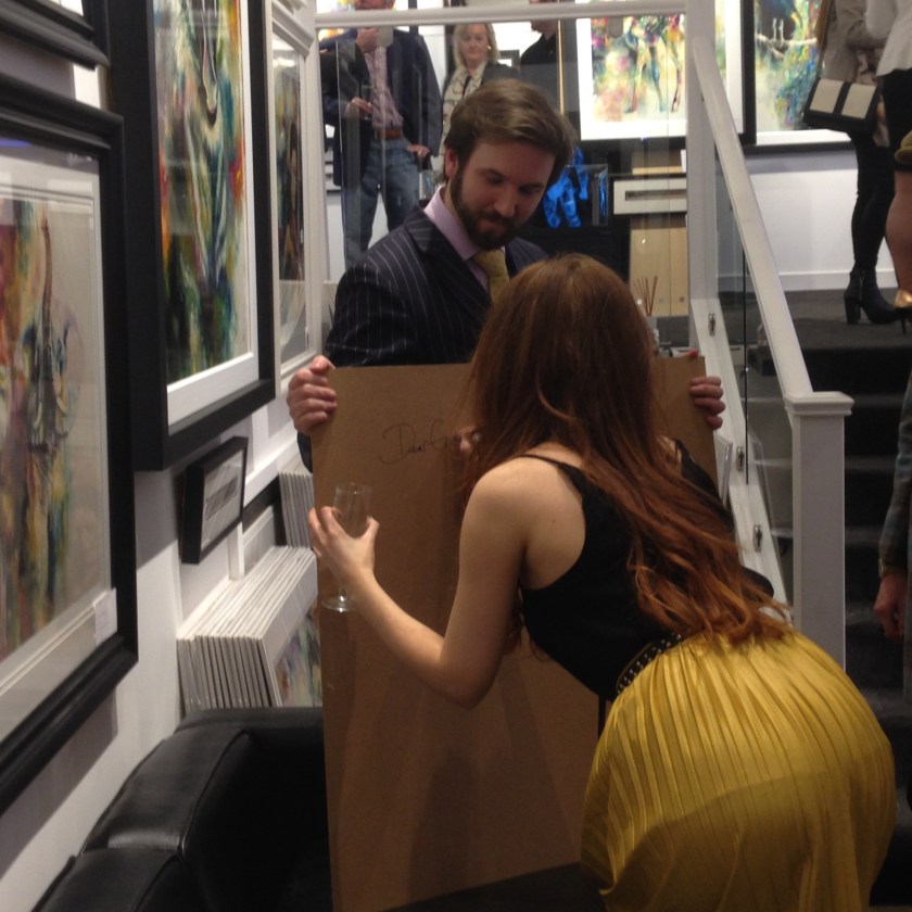
I get asked a lot of questions at exhibitions or through social media. Although I try to catch up on responding to comments, there is currently a lag. As a way of answering some of the very commonly asked questions regarding me and my work, I have compiled a list of FAQs to answer some!
What materials do you use?
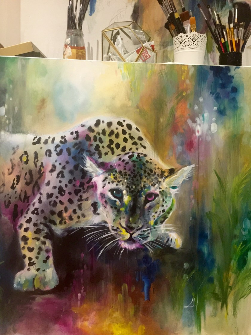
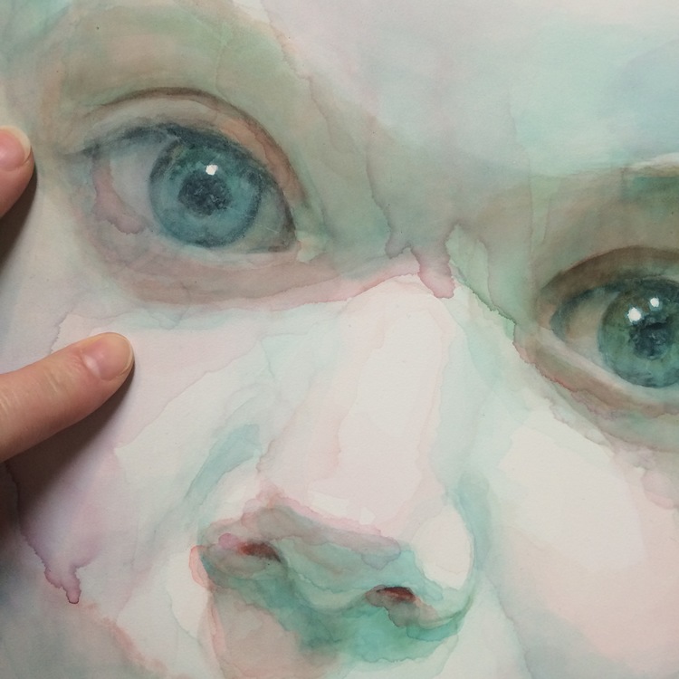
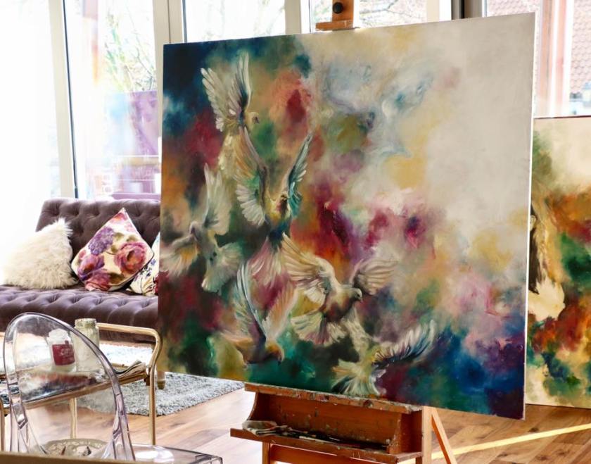
I paint in oil paints. A few years ago I tried my hand at mixed media work, and have also dabbled with watercolours. Aside from my sketches (which are mostly charcoal or graphite) I work exclusively in oil paints.
Oil paints are given a stigma for being difficult to use. Too thick, too hard to use, too long to dry… etc. This depends on how you paint and use your materials. For me, oil paints were the only option in moving forwards with my work, the traditional and classic tools for painting. (In my opinion) Because I had my heart set on painting with oils, I figured out how to make the material work for me and what I wanted my finished article to look like! A big misconception is that you can only do what the material allows. This is so untrue. I learnt about the basic molecular structure of oil paints and what I could use to thin, thicken and apply for the many results I wanted. I make the paints do what I need them to do, using any methods I can.
I work on gesso primed wooden panels as opposed to canvases. This is down to personal preference and based on the sort of finish you want for your painting.
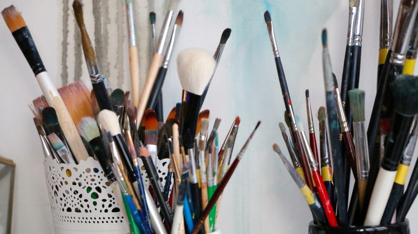
I use every kind of brush imaginable! All shapes and sizes help towards a more textured finish. My old favourites are filbert brushes (rounded edge) but I love to work on small details with an extra fine brush. Blending brushes, sponges and my hands are just a few of the other ways that I apply my paint.
What inspires you?
In terms of art, I have so many inspirations that would seem to not correlate to anything you can visually see within my work. Likewise, I have so many influences that you can clearly see within my art.
I was originally inspired by Odilon Redon and the way he used colour in such a soft and ethereal way. He worked in pastels that had a very smudgy and light effect, one I have taught myself to replicate in oils. I love anything from the renaissance period that boasted wistful and romantic themes.
I love Gustav Klimt for the abstract richness of his subjects. I love Claude Monet for his colour palettes. I love Turner for his magnificent take on skies. I love so many artist for certain elements of their work and am forever trying new techniques that are originally inspired by those, and incorporating them into my work. I have books of most of my favourite artists, all book-marked and heavily worn. I look through these books most mornings or when I am need for an inspiration hit! (Blog post coming soon on my book collection.) There are also some amazing artists online that feed my inspiration just with a quick scroll through a timeline! I am hoping to write more blog posts on these artists individually.
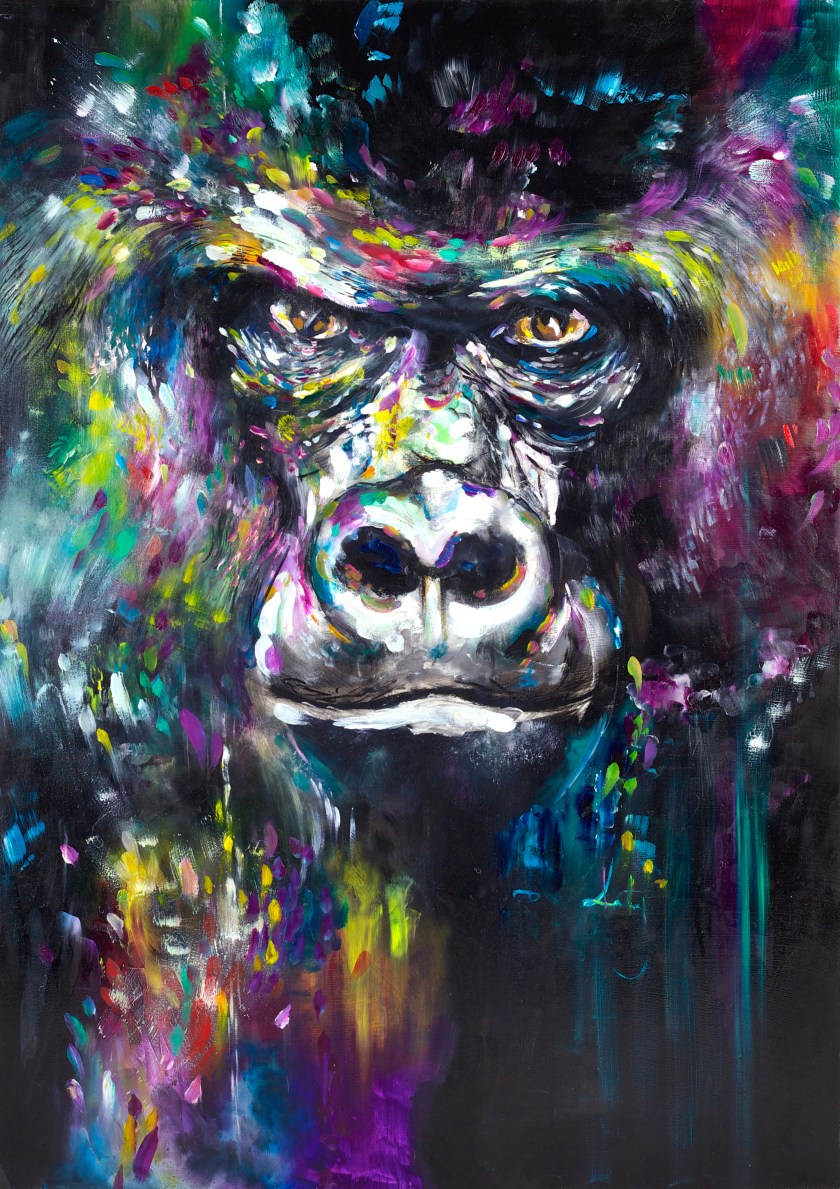
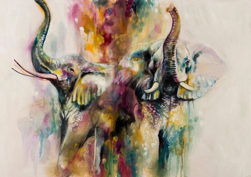
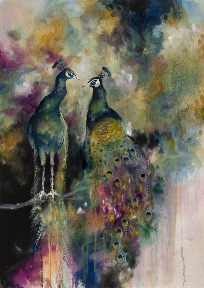
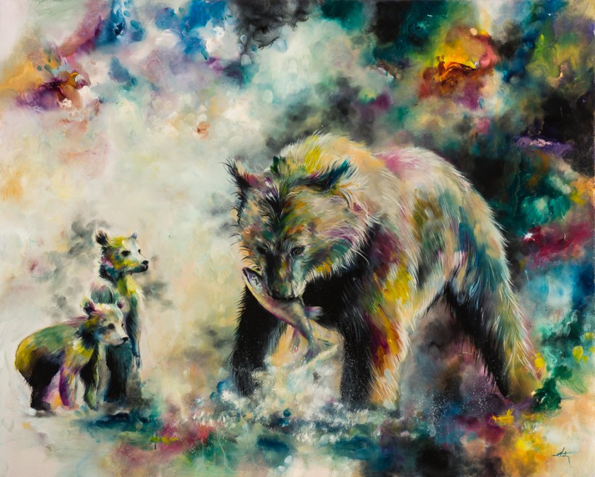
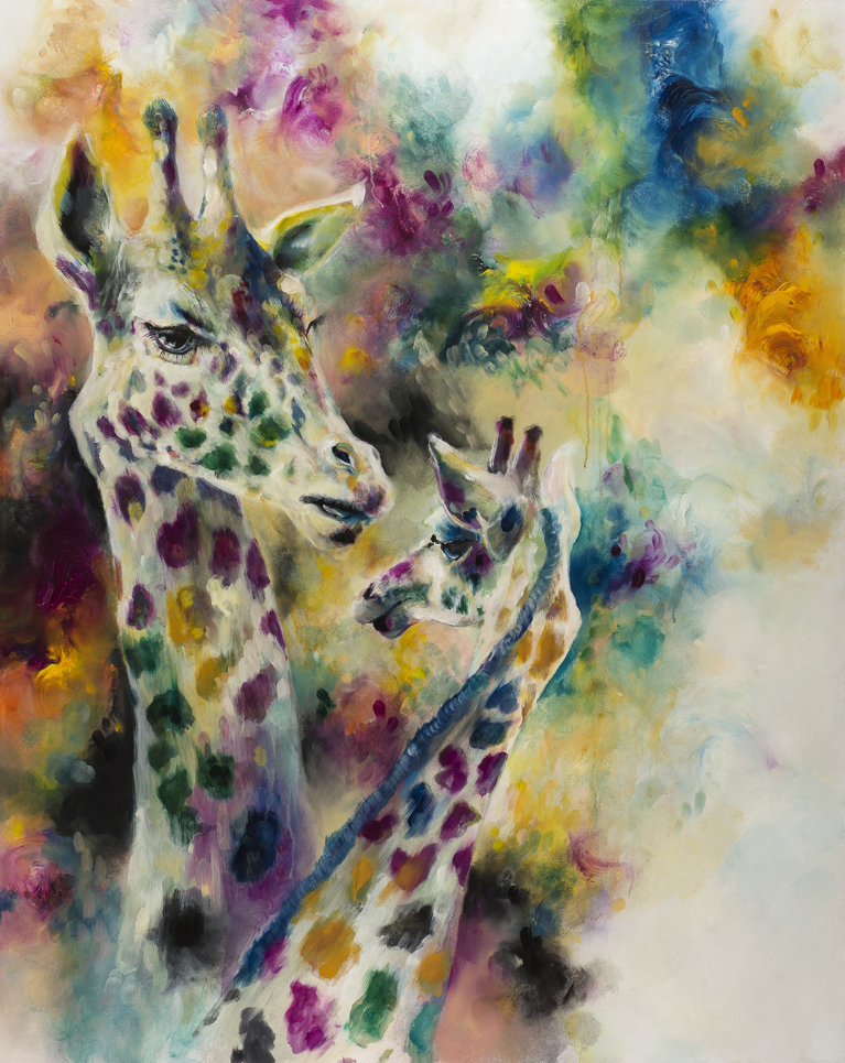
I am inspired by my subjects alone! When I am painting wildlife subjects I find so much balance from the nature of the subject itself. I find with wildlife, that once the subject is established, the work builds up around and fits into the characteristics of the animal. With figurative work, a facial expression can determine where the painting might go in terms of calm and serene, or full and energetic. You can have a whole painting planned to the smallest detail, but the nature that you see within the subject could change the painting process entirely. I would never fight this instinct!
Aside from artwork, I find inspiration from everywhere. I tend to look at ‘balance.’
Everything has a distributed weight, paintings can be intense for having more space filled with detail, or calmer for having more serene areas of less detail. The same applies to music, nature, design, interior decorating, gourmet food, filmography, and almost everything else! I am inspired by the balance I see around me and how things may be juxtaposed.
How did you learn to paint?
I taught myself to paint.
I have always been an ‘arty’ person. For this reason I studied art throughout my whole academic life, if you are an art student in the UK you will know of a very diverse curriculum which allows you to experiment with all types and formats of art. Through school and college I was able to dabble in painting, and understand the basics of acrylics. From this I acquired knowledge of colours, and aspects of importance that might make a piece of art ‘good.’ During my years at university, my course leant more towards contemporary assignments which rendered painting to be too traditional (boring??) for the requirements of the course. However in this time the curriculum taught me a lot in terms of theory, and challenged opinions and mind sets on art to articulate a strong dialect for written essays and papers. This side I loved.
I came back to the physical practice of art a year after leaving university. For the first time I was able to produce work on my own terms, that wasn’t in keeping with the requirements of an assignment.
I seemed to want to paint wildlife.
I decided to move from mixed media to oil paints. I had to teach myself to use colours correctly (or incorrectly if I preferred!) and to use the materials full stop! I looked at information available online, but I mostly learnt by actually practicing. For me in this instance, nothing could be more effective to my development as a painter, than to just get stuck in on my ideas. I have continued to work on developing, by actually physically getting on with ideas, which brings us to today.
How do I become an artist?
You don’t wait for someone else to determine what you are, and instead define yourself. If you paint, draw, sculpt, design, write, enjoy life.. Then you are an artist by default.
Just do it, actually get on with it! If you want to be a painter then paint something you love and enjoy yourself while you do it! Work harder until you get it right. Keep improving and stay passionate. This applies to anything and everything. If you want to be a writer, don’t head to google and ask ‘how do I become a writer?’ Just write stuff! Eventually, when you’ve worked hard enough, doors will open for you.
Do you sell your work?
Yes.
However I do not personally sell my art, on my website or in person.
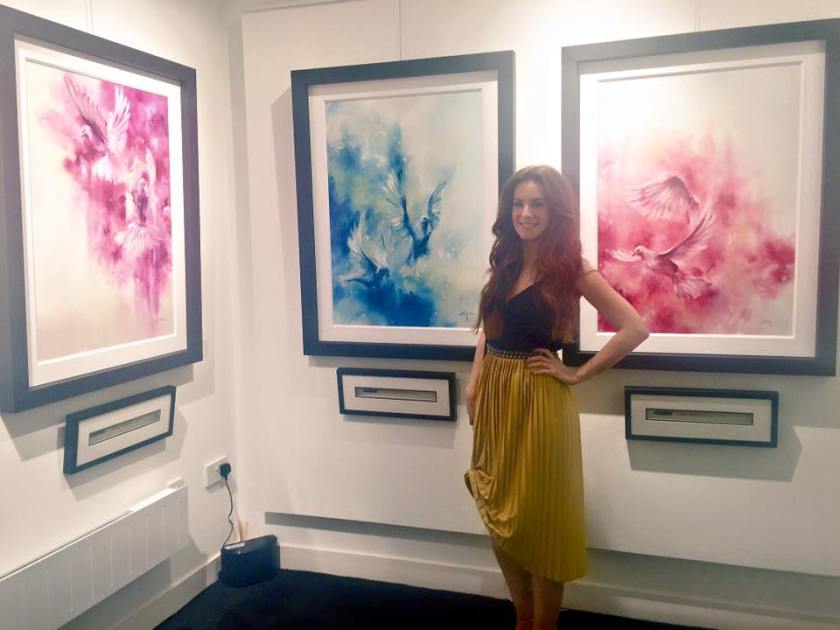
I work with a fantastic publishing house called Wishbone Publishing, who deal with the sales of my work (giving me more time to throw paint around!) We deal with a number of galleries across the UK who have area exclusivity in representing my work. Head to my website (www.katyjadedobson.co.uk) to see a list of affiliated galleries where you might find some originals or prints. Or send an email to info@wishboneart.co.uk where they will help you locate your nearest gallery!
I am often made aware of my work being sold elsewhere. If a painting or print is sold anywhere other than the galleries listed on my website and without a certificate of authenticity then it is not a certified piece of my art work and is an image of mine, stolen and not cited.
What is a Limited Edition?
In these galleries or events you might find an original or a print. Prints are limited number edition replicas of an original painting, printed on hahnemuhle paper, beautiful and true to life. Each is signed by me, numbered, and also comes with a certificate of authenticity. Usually run in numbers of around 75, these are found at the galleries mentioned on my website.
Which is your favourite painting that you’ve done?
I always struggle with this question… I generally get attached to each of my paintings, a side effect from spending so many hours focusing. There are often one or two from a collection that I find difficult to see go. I am currently working on a new collection, and there is one particular piece that I am find of. It is my whole essence in painting form, the first time i’ve ever felt that way about any work I have produced, rendering it difficult to include in the collection. (However I want it to be part of that particular body of work, which as a knock on effect, wouldn’t be a complete collection without it in my eyes)
Why do you use so much colour?
art1
ɑːt/Submit
noun
1.
the expression or application of human creative skill and imagination, typically in a visual form such as painting or sculpture, producing works to be appreciated primarily for their beauty or emotional power.
works produced by human creative skill and imagination.
creative activity resulting in the production of paintings, drawings, or sculpture.
the various branches of creative activity, such as painting, music, literature, and dance.
“the visual arts”
It should be imperative to anyone honing their skill or talent, that they produce something that they find enriching and not to be by means of satisfying a certain type of expectation. I have found, as in any industry, there are a few people who are critical ‘rain clouds’, and don’t want people to exercise their right to produce the work to look how THEY want it to look. This however defies the whole meaning of art!
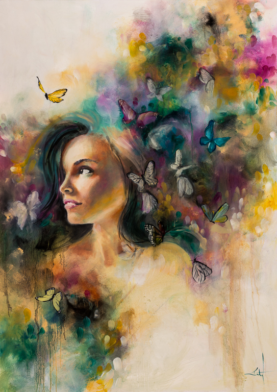
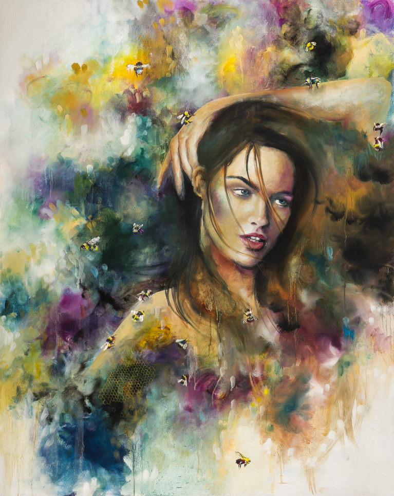
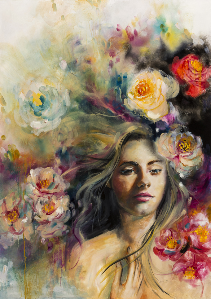
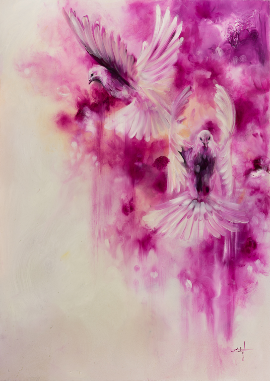
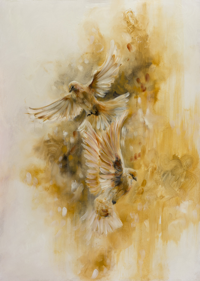
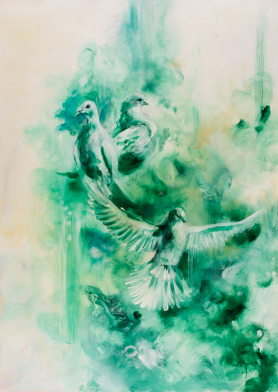
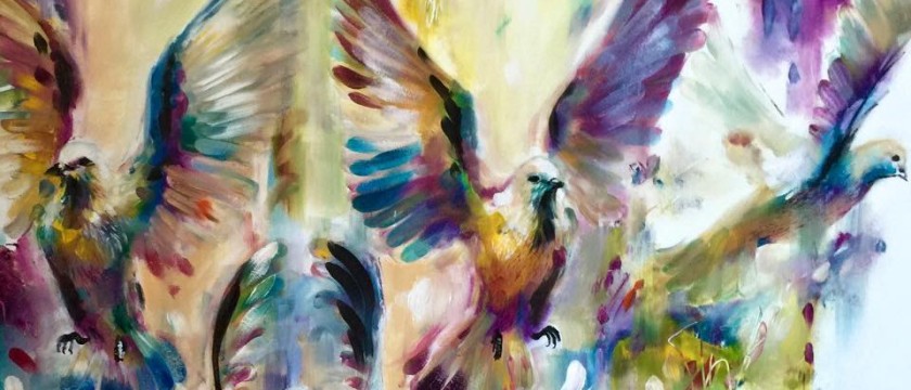
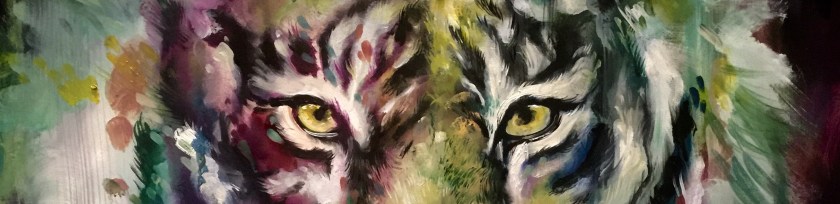
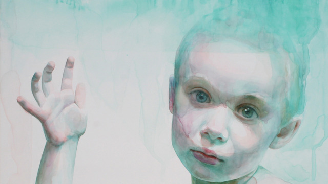
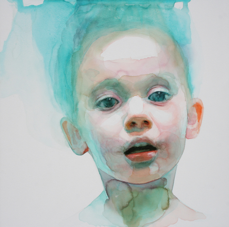
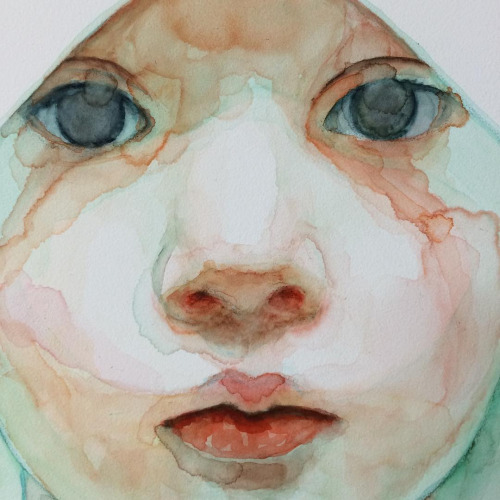
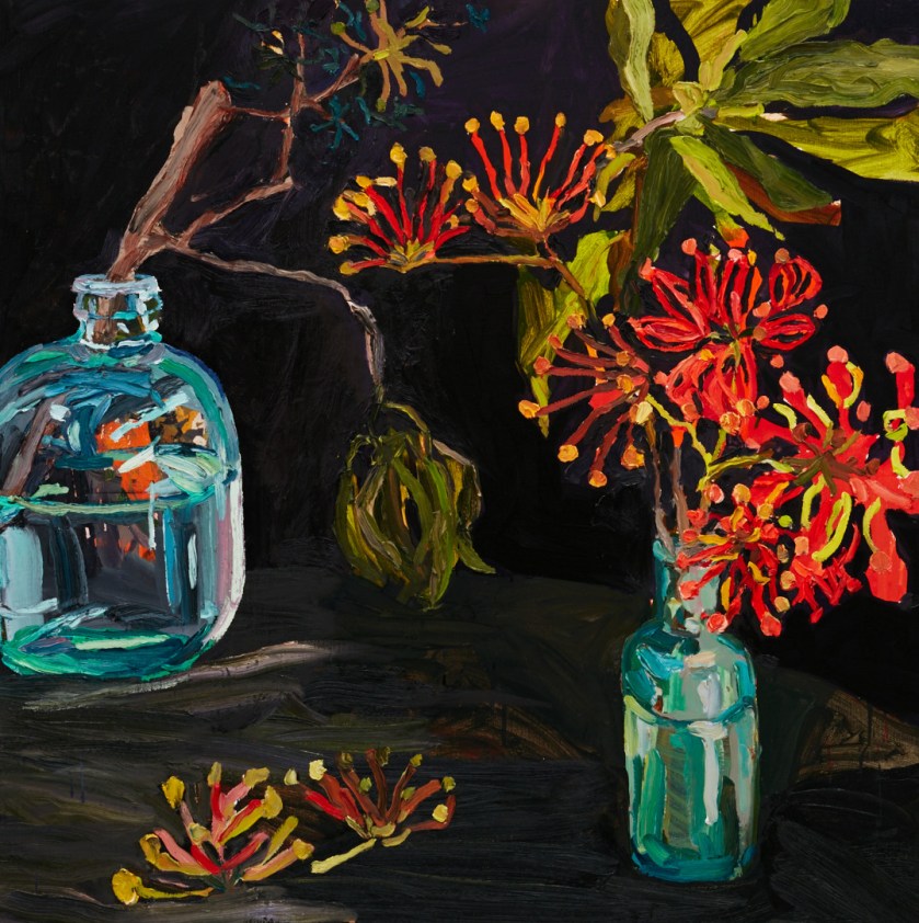
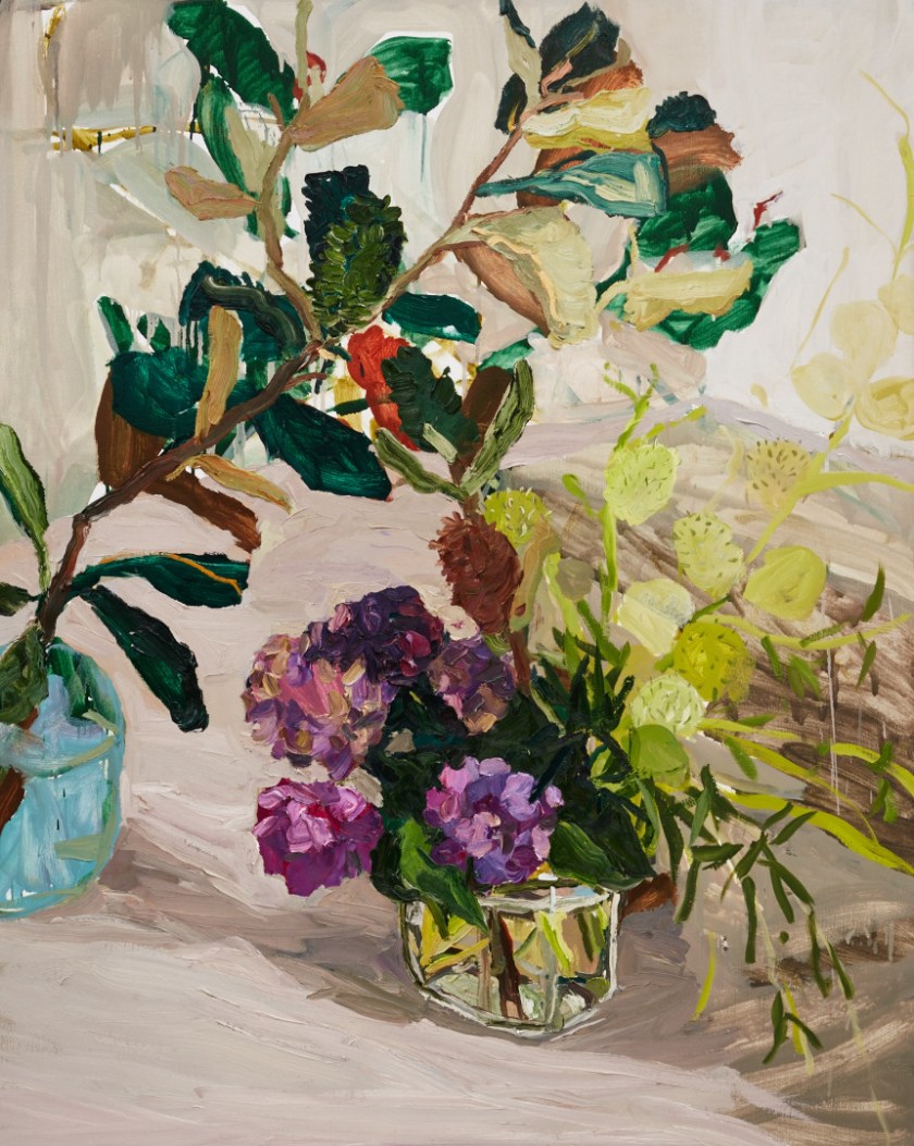
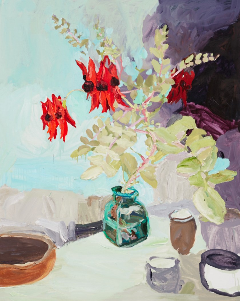
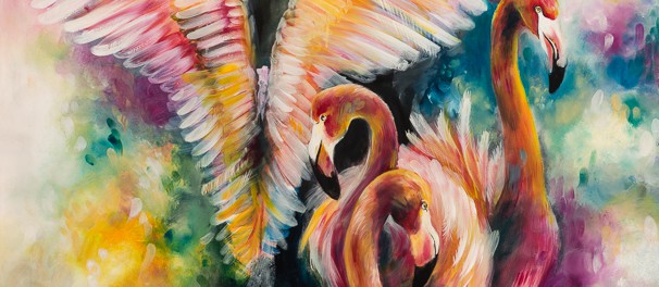
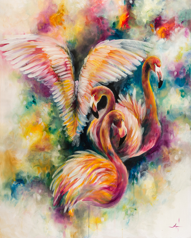
I have always laced colour throughout my work, even if it was to be one shade, splashed in on a tonal dark image. My use of colour came from some abstract work I painted as a way of taking my mind away from a difficult circumstance that I had found myself in. It was mostly for fun. Although I still produce personal work of muted colours and tones, at the moment, colour (as with any movement or development) is ever changing in the way that I use it (or don’t use it!)
Basically… I love colour. It makes me happy.
What are your future plans for your work?
Looking back through images of my older work, I can clearly see the natural evolution of my art that is so fluid and clear. There is a strong and established core style that I must emanate without actively pursuing, as the progression of my work has moved exactly where I would want it to go, without knowing that before hand. You can only see these things when looking back, but not looking forward. I know the quality of work I want to be producing and in what way, but anything else I will have to wait and see what I come up with!
x


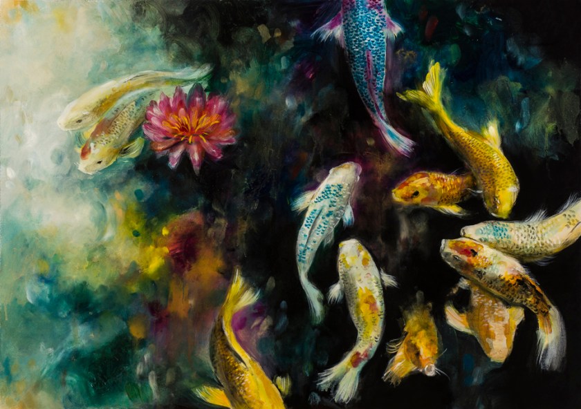 Koi / Original Oil Painting 25×35″